Top 5 Mistakes That Musicians Make on Their Websites
DIY website builders like Wix and platforms like WordPress have made building a site all on your own possible—even easy. However, musicians and bands still continue to make the same mistakes again and again when it comes to building their own websites.
In order to prevent you from falling into the same old traps, we’ve put together this list of five mistakes that bands and musicians make. We’ll also cover what to look for and different ways you can address these problem areas. So follow along…
Mistake #1 – The Layout and Content are Disorganized
The first mistake that band and musician websites suffer from is a disorganized and messy layout. Part of this stems from the fact that many musicians aren’t web designers and have to resort to website builders that can sometimes be difficult to use.
However, with a little time and effort, you can build a clean and organized website that makes sense to your fans when they visit.
To ensure your site is organized, make sure to:
- Include page links in your navigation menu to your music, videos, store, and biography pages.
- Avoid overloading the homepage with unnecessary elements.
For example, if you don’t tour often, it probably doesn’t make sense to include a tour dates listing section right on your homepage. Think about the most important elements and include those on your homepage (such as music player for your latest album or a photo slider with shots from your latest shows). For everything else, you can link to a page with more details.
Mistake #2 – The Site Content is Out-of-Date/Not Updated Regularly
To add to the first above on disorganized content, many band websites suffer from another content mistake: not updating their website with new content (the latest news, images from shows, videos, etc.).
If you don’t update your site regularly, what point is there for fans to keep returning to your website?
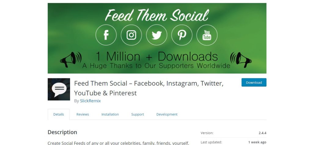
If you have a hard time working with the backend of your website, an alternative way to keep your site fresh is to use a plugin like Feed Them Social to import posts from Facebook, Instagram, Twitter, etc. all into one social feed on your website.
This way, fans can come to your website to see the latest news rather than having to follow you on all of these different networks.
Additionally, you can embed a playlist via a music hosting solution like SoundCloud so that you can keep adding songs to that playlist and have them automatically added to your website.
Mistake #3 – There’s No Mailing List Signup Form
Building an email list as a musician is an important part of creating a successful career in the music business.
While it’s great to have a lot of followers on Twitter or page likes on Facebook, having someone’s email address is extremely valuable. Unlike social media where you may need to pay in order for your entire fan base to see your latest post, with someone’s email address, you know that your messages will arrive in their inbox and it will be seen.
This is important for letting fans know about upcoming releases, shows, merch items, and so on.
On top of having a signup sheet at shows, including an email signup form on your website is another good place to collect emails.
However, many bands and musicians don’t utilize this helpful list building tactic.
With free email platforms such as MailChimp, you don’t need to invest any money to get started (MailChimp is free for up to 2,000 contacts).
MailChimp includes options for embedding signup forms so all you have to do is copy and paste the code.
However, another simple option is to use the free plugin MailChimp for WordPress which has pre-built forms that you can add to your site.
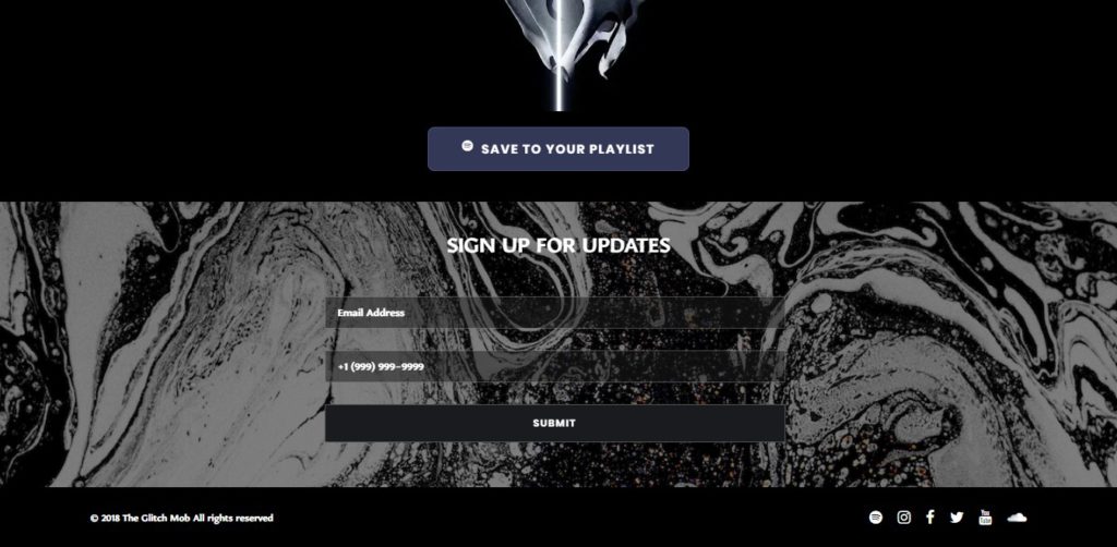
The form doesn’t need to be complicated, for example, here’s a simple signup form with just two fields on the website from the music group The Glitch Mob.
Mistake #4 – There’s No Shop Page/Webstore
Making money as a musician is always a struggle. To build a stable income from your music career, you need to take advantage of every opportunity you have to make money. So with that mind, why wouldn’t you include a shop page on your website?
It seems obvious, yet many musicians and bands lack a webstore on their website.
If your website is built on WordPress, you can use WooCoomerce to add e-commerce functionality to your site.
This way, you can create your own shop page on your website to look exactly how you want it and you’ll keep more of your money versus going with a solution like Bandcamp.
When selling merch on your site, you’ll only need to pay the transaction fees for a payment processor like Paypal (which amounts to 2.9% of the total sale value + $0.30 per transaction). Whereas you would pay 10% of each merchandise sale made through your Bandcamp store.
The tradeoff is that setting up your own store via WooCommerce is a bit more time-consuming and trickier to do. However, doing so will help you retain more of your earnings from sales. If you need help, step eight of this guide will help you set up your own store on your WordPress website.
Mistake #5 – The Site is Not Mobile-Friendly
What does mobile-friendly mean?
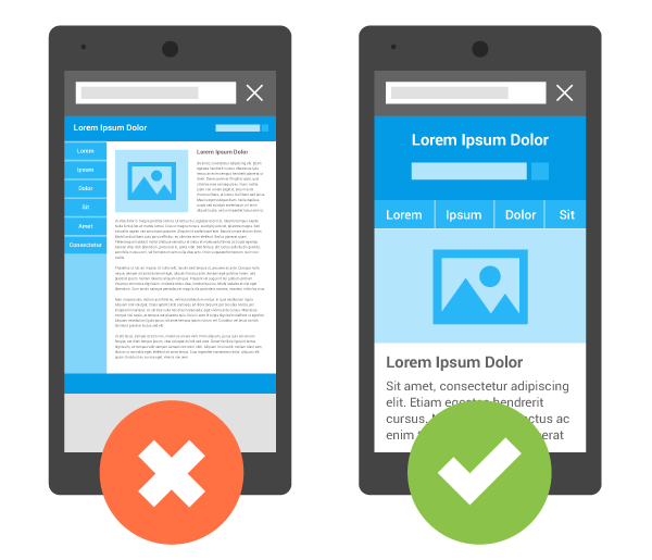
Having a site that is mobile-friendly means that it looks good and functions correctly on mobile devices. It should be just as easy to use on a tablet or smartphone as it is on a laptop or desktop computer.
When viewing the site on a mobile device, the buttons should be large enough so they’re easy to click with a finger and elements such as videos and music player should resize to the size of your screen. These elements shouldn’t spill off the edges so that you need to scroll horizontally to view them. That creates a poor user experience for your fans.
Yet, many musician websites suffer from a poor mobile experience on their website.
The simplest route to ensure your site is mobile-friendly is to purchase a premium theme. Many premium WordPress themes, such as the FWRD theme, are built to look good on both desktop and mobile devices.
You can find free themes that are mobile-friendly too, just make sure to test your website using Google’s mobile-friendly testing tool to make sure.
Don’t Make These Same Mistakes
Hopefully, this article has opened your eyes to the common mistakes that plague artist websites. If you pay close attention to mistakes in this article, and the tips to avoid them, you’ll be well on your way to creating a professional website that stands out from the pack. Remember to consider your layout, update your site regularly, add a signup form, include a store page, and ensure your site is mobile-friendly.
Please note: When you buy products through links on this page, we may earn an affiliate commission.


