To Mock the Stupendous Mechanism: Designing The Motherbrain’s WSW Console
How producer and studio owner Brian Bender turned a time capsule into a modern-day tone machine. Click to read the first, second and third parts of the series.
PART 4: The Housing Design
A small course correction for this installment.
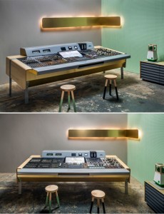
As I type these words, my assistant is actually running a session ON OUR NEW CONSOLE. I’ve already done four mixes on the thing, one of which played live in midtown for Oprah on Good Morning, America. Fo reals.
As such, I have a whole host of pretty pictures to throw your way and so I felt this would be a good opportunity to discuss Francois and UM Project’s role in this process.
So. Yay.
IT’S ALIVE. ALIVE!!!
On with the show.
Design is the physical language of the manmade universe. Almost everything we touch, every day (especially we denizens of the urban arboreal sphere) is a function of intention. In this era it’s increasingly easy and frankly, increasingly encouraged, to let these kinds of details slide past your view.
It could be argued that one of the primary reasons for Apple’s immense success is that they create an incredibly rich user experience with an interface that has been distilled to the absolute functional minimum. An iPhone only has six buttons and that’s being generous enough to include the screen in the count. Through this utterly minimal platform, infinitely expanding content exists in all of our pockets – everything from reruns of RuPaul’s Drag Race to the finer points of String Theory, presented in such a beautiful and seamless way that it seems to have always existed.
Contrarily, anyone still remember c:/DIR/W? Who could forget the hilariously British syntax hotkeys on G+ SSL’s?
One of mankind’s most defining attributes is the desire and ability to make tools. A studio, at its crux, is a set of highly specialized tools, collected and organized for the single focus of realizing the dreams and desires of the musicians that dwell within.
I can remember the first time I realized consciously just how much design is involved in building recording studios. Everything from the choice of console to the palette of finish materials was hand-selected as a function of the desires of the owners, users, and techs. Further back in history, these types of decisions even included the minutiae of the component electronics in the gear the in-house technicians designed and hand wired.
Of course, one of the most famous examples of this in audio design is the fader. When Tom Dowd approached the problem of ergonomics with the then-standard rotary gain control, his response was to exchange rotary faders for the linear taper fader in order to be able to more effectively manipulate more signals at once; a stroke of genius that absolutely revolutionized all future console design to this point in history.
I’m DEFINITELY not trying to say we’ve made the fader here, but the line of reasoning which brought about the fader in audio is the same one talented designers utilize in their daily lives. What is the essential function of this tool and how do we make it better? To watch Francois Chambard artfully navigate this area of reflection is nothing short of inspiring.
So, then, how do you set out to make a functioning piece of art that will inspire for the next 50 years?
When we began our conversation, we started with the needs. We needed a unifying home for the three disparate elements at work: The WSW channels, the Tonelux backbone, and the Pro Tools interfaces that helped to make it all seamless (and effectively far more flexible for routing purposes without adding unnecessarily redundant electronics).
One of the things I find to be the biggest bummer about working with Pro Tools in a traditional large format console room is the fact it almost invariably takes you out of the mix position. The ubiquitous shitty IKEA cart leaves the engineer with only one ear facing the speakers. This increases fatigue and diminishes your ability to meaningfully monitor changes in real time if you’re editing automation, plug-in parameters, etc.
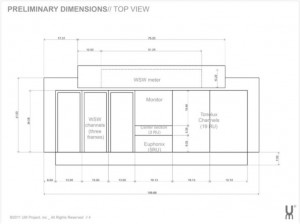
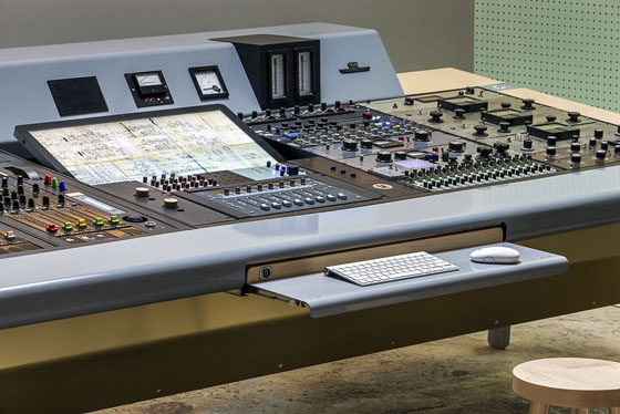
So, start with the display monitor and user interfaces in the middle. Also, we chose to put the Tonelux rack that houses the SM-2, CR-2, as well as the FX-2 modules that bring the WSW direct outs into the Tonelux mix buss right in the middle for easy access to the WSW pan controls, monitor source and volume control, etc.
Next, we addressed the preliminary dimensions. The Tonelux and controller were easy. They conform to the 19” rack standard so we’d need some racks. Eventually, I want to grow the Tonelux rack to 32 channels of Shadowmix moving faders on MX-2d’s, so we wanted to have two 19” bays.
The WSW channels came with frames in the original pop metal boxes that were already sort of perfect. They are beautiful, built to outlast the cockroaches, and purpose built. From this inclusion, we began to develop a set of dimensional constraints that would inform the rest of the shape of the desk. That frame size determined how much rack space could be on the other side of the console, for example. We now also had a working understanding of approximately how wide the desk would be overall, given 3 WSW buckets, a center section large enough to house the Apple LED Cinema and two 19” bays.
(This is just a small example of the way in which each decision informs all others that follow and also just the tip of the iceberg…)
Finally, we needed to have good metering (duh) so we included plans for a meter bridge to house several of the original WSW meters as well as the modern Dorrough 40-c’s
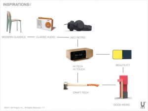
From these physical requirements, Francois and I began to discuss the elements of design from the past that excited and inspired us. When we first sat down to really discuss the project moving forward into fabrication, he put together a stunning presentation and included several headings to consider that spanned a myriad of aspects. The categories he included were:
Modern Classics – Charles and Ray Eames, Alvar Aalto, Eero Saarinen, George Nelson, Jean Prouve, etc.
Classic Audio – Neve and Rahms, etc.
Neo Retro – The movement to create classic feeling products, revolutionized by modern abilities in manufacturing and design.
Hi Tech/ Hi Touch – The seamless unity of cutting-edge consumer tech with proper old world craftsmanship.
Craft Tech – Small-batch artisanal design. Short run products, usually manufactured by hand with a zero-compromise mentality in materials and presentation.
Beautility – A portmanteau of Beauty and Utility. The ways in which design can add aesthetic beauty to the interaction with – and thus enjoyment of – banal, everyday objects.
Good Weird – Strange and inspiring and not Bad Weird.
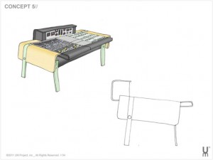
Next, he showed me a series of preliminary sketches of six different concepts that he’d begun developing since our conversation began and suffice it to say, I was absolutely blown away. Francois does all these types of conceptual drawings by hand in order to intimately include his personality as a designer.
After a few weeks of heavy meditation, we decided #5 was the vibe but that we wanted to tweak the meter bridge a little to further reference the raked angle of the original WSW meter bridge. With that small change, all our collective jaws hit the floor and they haven’t come back up since.
Now, given a rough plan for the dimensions and presentation, we began to discuss a materials palette. Every New Yorker knows black is the cornerstone of the well-dressed human and that is no exception in audio aesthetics. We’ve all spent hours on that ubiquitous black studio couch of questionable provenance. Black goes with everything; it’s the easy answer.
However, Francois really wanted to distance himself from the traditional presentation in audio design. With few exceptions, the classic color scheme tends toward dark or muddy colors. I would offer that this is historically true because most people involved in the aesthetic design of recording consoles are really just fulfilling a function (a place to safely send voltages around and protect the gear) as opposed to trying to make anything enduring and beautiful, aside from the gear of course. Practically speaking, it also means that your dark colored console probably won’t clash with the puce and chartreuse studio of your dreams.
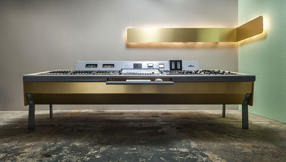
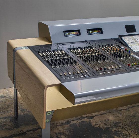
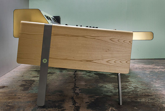
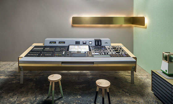
Since we already had so much dark in the picture from the glistening black enamel of the WSW’s faceplates, he wanted to offset that with matte, clear coated Ash for the sides. In a nod to the original, he chose a warm grey for the ceramic enamel of the meter bridge, armrest, and legs. Finally, he included two UM Project signature touches of a brass underbelly and the powdery machine green for the connector panels and bolt covers that join the legs to the body as a bit of good weird.
If I’m being honest, I was really not into the brass to begin with. I was worried it was going to be too flashy and too over-the-top to have such a prominent place on an item such as this, which is to be the center of my world for so long. However, at his urgings and that of my lovely lady fair and Mr. Anderson, we moved forward with brass. Now that I have the benefit of hindsight, I would have been a fool to go with anything else. Add it to the list proving Francois’ irreproachable aesthetic.
What you see here is the physical proof of that fact, too. I say goddamn.
Next Up! Design is Designer Part 2: Applied lessons in Advanced Routing Techniques
Brian Bender has enjoyed the pleasure of running sessions at Looking Glass, The Hit Factory, Electric Lady and many more beautiful rooms in New York and beyond. His co-conspirators include names as diverse as Philip Glass, The Counting Crows, Al Green. Borusan Philarmonie and Craig Street. Recent clients include Krystle Warren and the Faculty, Sister Sparrow and the Dirty Birds, Jose James and Langhorne Slim.
Please note: When you buy products through links on this page, we may earn an affiliate commission.


Deane Patterson
November 19, 2012 at 4:18 am (12 years ago)I am inspired to take a step back and consider how design could not only improve the efficiency, but inform the creativity of my studio. Great read – I would love to see an image from over the top (or at least the perspective of someone working on the console)
Brian Bender
November 26, 2012 at 4:19 am (12 years ago)Thanks Deane! Glad you’re digging it! There are a few more chapters besides if you’d like to get a little deeper into our process. I have a few more great pictures (including the aerial shot you’d mentioned) that I’m saving for the next installment
Zach McNees
November 26, 2012 at 3:55 pm (12 years ago)LIKE! Why 7 faders per bucket? Looks incredible
Brian Bender
November 29, 2012 at 1:49 pm (12 years ago)Man I really have no idea haha… that’s the way the built the subframes so we went with it 😀
jeek
November 29, 2012 at 7:10 pm (12 years ago)Where are all of the piles of papers, manuals, wires, empty cans, CD spindles, media, and braindumps that are piled up on my setup kept?